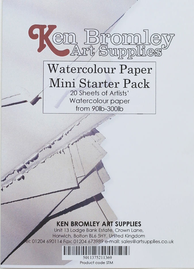
When starting out with watercolours, the sheer number and variety of papers on offer can be quite daunting.
In choosing a watercolour paper, there are a number of factors to take into consideration. The main consideration will always be in the first instance, how thick it is, and importantly will it be strong enough to take the wet diluted pigment.
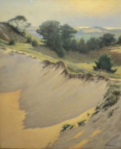
The desired final effect you wish to achieve will be another important consideration, the texture of the paper – how rough or smooth it is and how absorbent the paper is (some papers absorb the paint more whilst with others the paint lies on the surface longer allowing for different approaches to the painting). All these will impact the final result of your painting.
The colour of the paper used is another important consideration. You do not have to use just white paper (and there are many different shades of white here), you can also use toned papers with watercolour. Although they require a slightly different approach, some interesting effects can be achieved.
Another oft-mentioned question is do I have to stretch watercolour paper? Let’s look at these issues in turn.
Paper Thickness or Weight
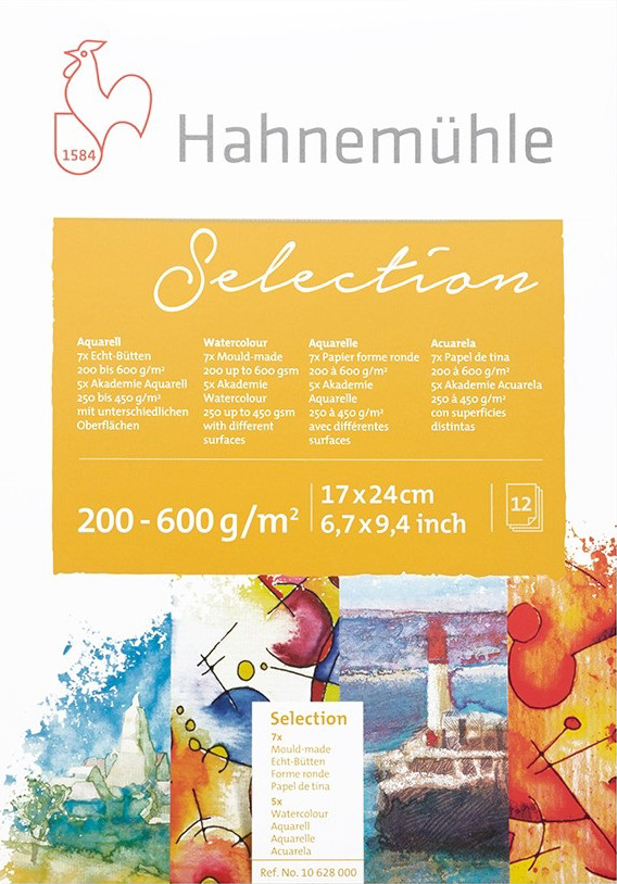
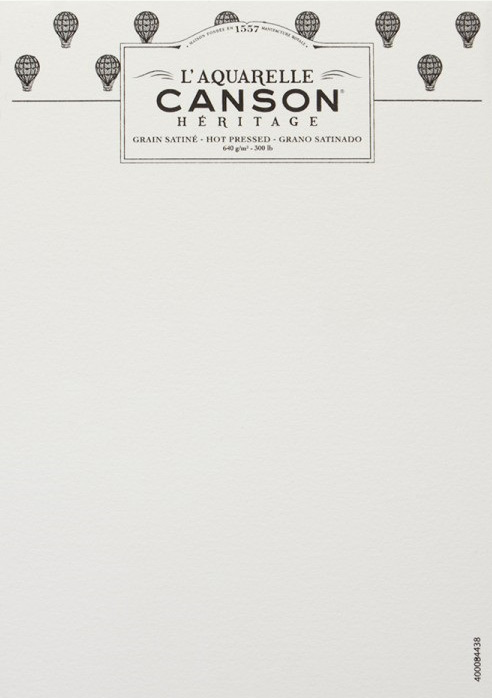
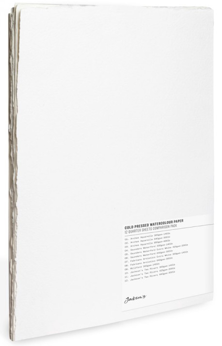
Paper thickness is indicated by its weight. Today this more often than not shown in grams per square metre (gsm). The old Imperial measurement was in pounds per ream (lb); this was based on the actual weight of a ream of paper – or 500 sheets of an Imperial ‘Full’ sheet of paper which is 22” x 30”. The two most commonly found standard weights are 90lb or 190gsm, 140lb or 300gsm, but they can be as heavy as 300lb or 640gsm or more, and are the thickness of card.
Why is weight of the paper important? The main issue in watercolour painting and paper is how it reacts when in contact with water. The action of water on paper causes the fibres that make it up to expand when wet. The lighter the paper the more likely it is to buckle with the application of water, and it will as a result need to be stretched before use. The thicker papers are more resilient, are able to take more washes and glazes and allow of more robust working methods.
To get around thinner paper cockling, some paper is sold in pads which are glued on the edges on all four sides. The disadvantage with this method, whilst stopping the paper from cockling means it has to remain in the pad while you are painting, which is not always convenient or practical. The other inconvenience is you need a knife to detach the paper once painted upon.
As always, there is no hard and fast rule as to what you do, many watercolour artists stretch all their paper, but this really can become quite tedious. My advice is that if you use 300 gsm weight paper and above, and you don’t intend to flood the paper with water, you will get away without needing to stretch the paper.
Texture
Other than being distinguished by weight, there are three basic types of watercolour paper, complicated further by the knowledge that textures from different manufacturers differ.
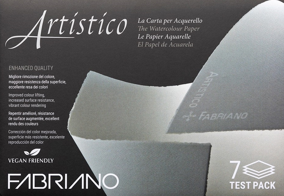
The three main types are ‘Rough’, ‘HP’ or ‘Hot Pressed’ and ‘CP’ or ‘Cold Pressed’ which is often called ‘Not’ in that it is not Hot Pressed.
Rough:
Rough paper has as the name suggests a distinct tooth, made by pressing it between sheets of textured felt, and is not pressed between smooth rollers. It leaves a crackled effect when the brush is drawn across the surface as the pigment settles in the indentations. Not to be recommended for fine, detailed work and is more suited for expressive work.
Not or Cold Pressed:
Made by pressing through cold metal rollers, both names are used for this paper that has a slight tooth to it and is probably the one most people begin to use when starting out in watercolours. It is suitable for some detailed work as well as allowing for some slight texture.
Hot Pressed:
The smoothest of the papers, pressed between 2 hot rollers. Best suited for those wanting finely detailed work, such as botanical illustration.