2-Colour Painting!
We are now into our 13th week Challenges – with to date over 130 paintings and drawings submitted! For this week’s challenge there is no “Theme” as we have had previously. Rather the challenge we are setting for you this time could be considered a more ‘technical’ one! But fear not, nothing too gruelluing – we promise!
If we mention “Contrast”, “Light and Dark”, “Tone” these words may conjure up, from what now seems the distant past, comments we made about your pictures you worked on at the studio. With many of the pictures you have submitted for the challenges, this aspect has become one we have had cause to raise with a few of you.
Tonal values and contrast are more important for improving your painting than colour and you can significantly improve your painting by mastering this one thing. The lights and dark’s in your picture contribute more to it’s success than any other factor, and their juxtapositon creates interest – a focal point – in your work. So what do these words mean? It really is quite straightforward and nothing to worry about – but the improvement will be enormous!
VALUE
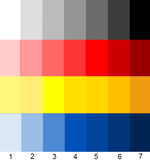
Most of you may recall at some point that I have shown you a “Value Scale” – think piano keys here – whereby you start with the deepest black you can make and then gradually reduce the darkness until you arrive at pure white – see below – either in pencil or paint.

Essentially, without complicating things, every colour has its own ‘Value’ scale similar to the above black to white one. To ensure that your picture ‘zings’, you need to ensure that there are sufficient areas of “Contrast” between LIGHT areas and DARK areas – ie from points on the scale furthest apart from each other.
Below we have drawn up a very rough guide to illustrate this. If when you paint your colours are all in one area – (3-5 for example) the finished picture will not have as much impact as if you had varied the strength of the colours to the lighter or darker ends of the scale.
When starting out with this concept it can sometimes be difficult to work out given the vast array of different colours available to you. A much easier way to start is to limit the colours that you have available to use, to make you think more in terms of the simple black to white scale. To that end your challenge this week is to produce a painting – or pastel – using only 2 colours + White:
Ultramarine Blue
Burnt Sienna
Use White to vary the tone but try and get the darks by mixing the Sienna and the blue – we don’t want to see any black being used – and we will know!
What subject I hear you say – well, we will leave this to you, the only stipulation is you must use only these two colours!
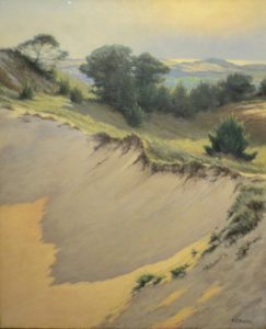
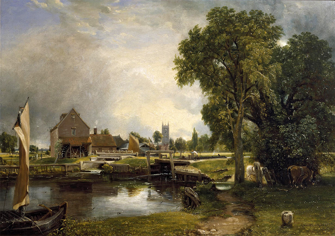
When choosing the image you are going to paint, think about photographing it or if already photographed, put it into the computer and turn it into black and white. This will help you to see more easily the different tonal values in the image. (See below where we have turned this Constable painting black and white. You can see how the lights and darks are still very pronounced.) Alternatively, just try squinting which helps reduce everything to light and dark areas. Detail is the enemy here!

Click on the button below to download a sheet to make your own value scale – try it for as many colours as you like!