


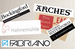
Which Watercolour Paper Do I Choose? When starting out with watercolours, the sheer number and variety of papers on offer
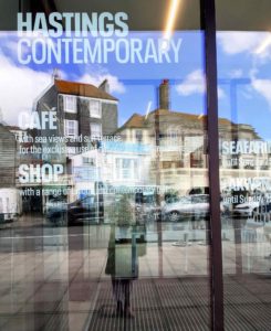
Hastings Contemporary The Stade, Rock-a-Nore, Hastings 30 April 2022 to 25 September 2022 After a long absence we finally were
Musée du Touquet-Paris-Plage “The Etaples Art Colony between 1880-1920” A beautiful sunny day tempted us to get in the car
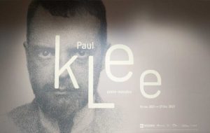
LAM – Lille Métropole Musée d’art moderne (Paul Klee 1879-1940) It’s been a long time since we have been able
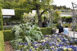
Côté Jardin: Monet to Bonnard After recently spending a few days in Normandy and the Orne, we returned home via
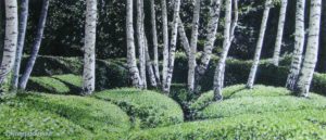
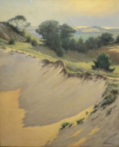
“Gardens” an Exhibition of Watercolours by Jean-Pierre Champdavoine at Nogent-le-Rotrou A few days ago we were visiting the town of